How to Pick a Virtual Staging Style That Doesn't Look Fake (2026 Guide)
How to choose between modern, traditional, coastal, mid-century, and farmhouse virtual staging styles for a listing — what each style says about a property, what mistakes break the illusion, and the rule that beats every style choice.
Short answer: the style that wins is almost always one notch under-stated relative to what you'd choose for a magazine shoot. Modern reads cleaner than mid-century, mid-century reads cleaner than full-traditional, and full-traditional reads cleaner than "luxury." The two failure modes that make staging look fake aren't style choices — they're scale errors and material mismatches. Get those right and any of the five major styles works for almost any property.
This guide walks the five virtual-staging styles real estate listings actually use in 2026, what each says about the property, and the three rules that beat every style choice. By the end, you'll know which style to request when you place an order — and what to ignore in the "ten staging styles to choose from!" marketing pitches some virtual staging services lead with.
The five styles that actually sell a listing
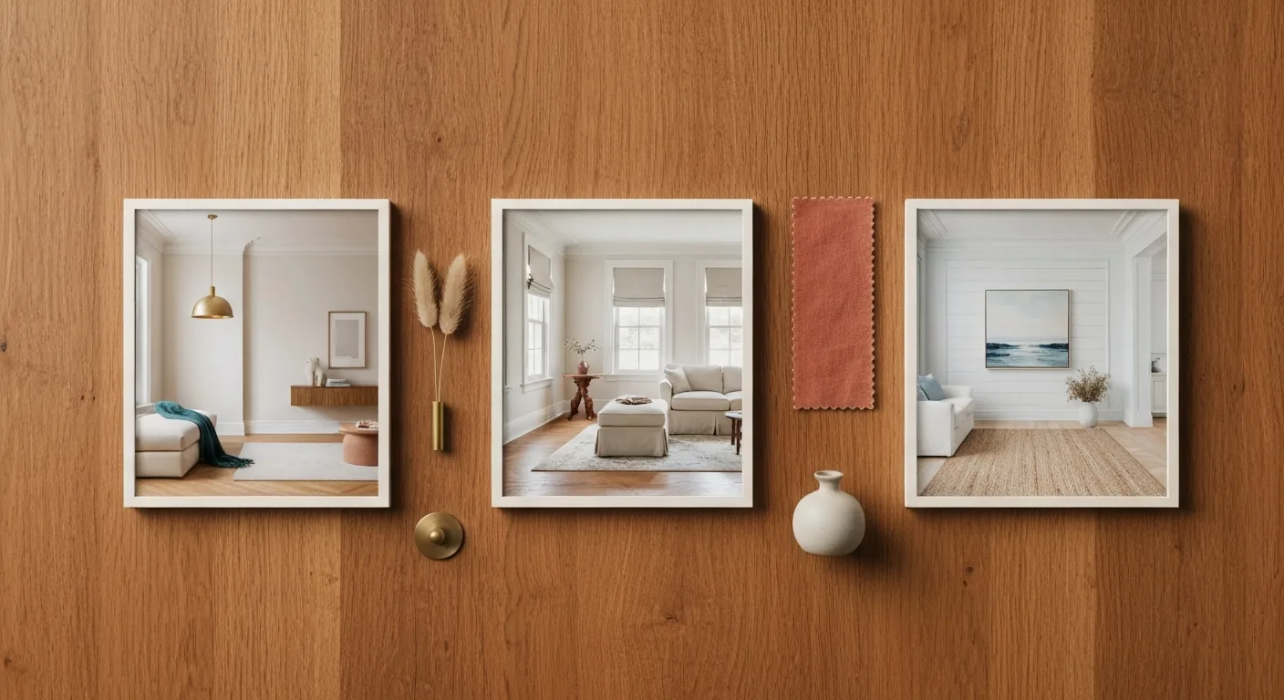
Most virtual staging services advertise 8–12 styles. In real listings, five of them do 95% of the work. The rest are flourish — useful in narrow contexts, distracting most of the time.
1. Modern (light)
Cream walls, oak or pale wood floors, neutral linen upholstery, brass or matte-black hardware accents, a single saturated accent color (usually deep teal, dusty terracotta, or olive). Furniture lines are simple and low-profile. Plants are present but not theatrical.
Best for: new construction, recent flips, urban condos, properties under 25 years old, neighborhoods with younger buyer demographics, smaller homes (modern furniture's lower visual weight makes rooms read larger).
Mistakes that break it: mid-century chairs (those don't belong in "modern" — they're a different style; see below), aggressively patterned rugs, more than one plant per room, anything with brass legs and a glass top (1980s revival, reads as dated).
2. Traditional (light)
Warmer wood tones (walnut, cherry, dark oak), upholstered furniture with skirts (not legs), patterned area rugs (subtle), framed art with classical themes, table lamps over floor lamps, layered window treatments (sheers + curtains).
Best for: older homes (pre-1980), East-Coast suburbs, larger family homes, listings where the buyer demographic skews older or established (40+).
Mistakes that break it: anything with chrome, modern-style lighting (pendants over breakfast bars look wrong here), overly busy rugs, too many small accessories ("knickknack-ed" surfaces read as mom's-formal-dining-room, which buyers rarely want to inherit).
3. Coastal
Whitewashed wood, soft blues + sandy neutrals, white linen slipcovers, woven jute or sisal rugs, light-rope accents, framed seascape art (subtle, abstract — not literal). Rattan or whitewashed wood furniture lines.
Best for: beach properties, anything within 10 miles of a coast, vacation homes, second-home listings, Florida/California/Carolina/PNW markets, anything pitched as a short-term-rental ready property.
Mistakes that break it: literal "beach" decor (starfish, sand-in-jars, "Beach House" wood signs — reads as Pinterest, not professional), aggressive nautical (rope, anchors), bright primary blues (looks Disney). Coastal that works is restrained: think Architectural Digest coastal, not Marshalls coastal.
4. Mid-century modern
Walnut wood, tapered legs, low-slung silhouettes, mustard-yellow or burnt-orange accents, sculptural lighting (Sputnik chandeliers, cone pendants, arc floor lamps), geometric area rugs.
Best for: ranch homes (1955–1975), Eichler-style architecture, neighborhoods like Palm Springs / Austin / certain Bay Area pockets, lofts, properties already partially MCM-styled where you want to commit.
Mistakes that break it: mixing with traditional (the two styles don't blend — pick one), too much yellow (one accent only), pretending a 2010 spec house is mid-century (the architecture has to support it; otherwise the staging fights the bones).
5. Modern farmhouse (use sparingly)
Whitewashed shiplap, black metal fixtures, distressed woods, neutral upholstery, a single statement of "rustic" (a barn door, an exposed beam, a galvanized pendant). The Joanna Gaines aesthetic, dialed down.
Best for: rural and exurban properties, older properties already partially renovated, the Southeast and Midwest US.
Mistakes that break it: anything that says "Live Laugh Love." Anything mass-market HomeGoods. The line between "modern farmhouse done well" and "Pinterest 2017" is thin — when in doubt, pick traditional or modern instead. Ask for "modern farmhouse" only if the architecture genuinely supports it (visible beams, plank floors, real farmhouse roof line).
What buyers see vs what marketing copy says
A study from the National Association of Realtors profile of home staging consistently finds that buyers visualize themselves in a property faster when the staging is underspecified. Style-heavy staging signals a personality — and personality is the buyer's job to imagine, not the seller's job to impose.
The practical implication: ask for one notch less than you think. If you want "modern," request "modern, leaning minimalist." If you want "traditional," request "traditional, on the lighter end." If you want "coastal," request "coastal, restrained." Virtual staging services tend to deliver what's requested — so request restraint.
The three rules that beat any style choice
These are the rules that decide whether staging looks like a real lived-in space or like a Sims rendering. Get all three right and you can pick any style and it works.
Rule 1: Match the architecture's era
Don't put mid-century in a 2020 spec colonial. Don't put coastal in a Chicago brick three-flat. The staging style should be a defensible match for the bones of the building. When the era doesn't fit, the human eye knows immediately — even if the viewer can't articulate why.
If the architecture is genuinely "neutral" (e.g., recent townhomes, urban condos, '70s ranches), modern (light) is almost always the safest pick. It works on the broadest set of buyers and never reads as wrong.
Rule 2: Scale furniture to the actual room
The single biggest "looks fake" tell in virtual staging is sofas that are too small or beds that are too large. Real bedrooms have queen beds, not king beds, unless the room is genuinely 14×16+. Real living rooms have 78–84 inch sofas, not 96-inch sectionals, unless the room is genuinely 16+ feet wide.
When you place a virtual staging order, send the room dimensions if you have them. If you don't, send a reference photo with a person standing in the room (we measure based on the proportions). Furniture-to-room scale is the #1 thing reviewers note when staging looks "off" — and it's the easiest to fix on intake.
Rule 3: One color story per room, two per house
The fastest way to make staging look amateur is to shift color palettes between rooms. A modern living room with cream + teal + brass should be followed by a kitchen with cream + teal + brass — not a kitchen with sage + black + bronze. Houses that read as "designed" have a single color story running through, with maybe one secondary palette in a single room (often a bedroom or office).
When you place a virtual staging order across multiple rooms, pick one palette and stick to it. Or ask us to pick — we default to cream + warm oak + a single accent (terracotta, teal, or olive depending on what the house architecture suggests).
When to pick which style: a 30-second decision tree
- Property under 25 years old, urban or suburban → Modern (light)
- Property over 30 years old, established neighborhood → Traditional (light)
- Property within 10 miles of a coast → Coastal (restrained)
- Genuine mid-century architecture (1955–1975 ranch, Eichler, etc.) → Mid-century modern
- Rural property with visible rustic architecture → Modern farmhouse
- Anything else → Modern (light)
If you can't decide between two: pick the simpler one. Restraint reads as confidence; over-styling reads as compensation.
What we do when you don't pick a style
When a Virtual Staging or Full Listing Package order arrives without a style note, our default workflow:
- Look at the architecture. If we can match it to one of the five styles above, we go with that.
- Look at the listing photos for cues. Existing furniture, paint colors, hardware finishes, art on the walls — these signal what the house "wants to be."
- Default to Modern (light). When the architecture is neutral, we use cream walls, oak floor, linen upholstery, single warm accent. This works on 80% of properties.
You can always override with a one-line note in the email: "stage as coastal" or "modern farmhouse — barn door already in the dining room." Pricing for Virtual Staging ($99 single listing) and Full Listing Package ($249 with up to 5 staged rooms) — first listing 50% off so you can see the work before committing.
Related reading
- ★ Comprehensive guide: The 2026 Real Estate Listing Assets Playbook — all 8 asset categories, the 2026 compliance landscape (AB 723 / NAR / state MLS), the cost framework by listing price, and a 90-day investment plan for new agents.
- The 12-Point Listing-Photo Checklist Before You Send Anything — what to do on the raw-photo side before staging
- California AB 723: AI Disclosure Rules — what the disclosure looks like on a staged image
- See sample staged listings — bedroom, living room, kitchen, bathroom before-and-after pairs
— DoorAppeal team [email protected]